A Logo Reality Check for Place-Based and Local Brands
If your business is rooted in a place, your logo has a harder job than most.
It has to live online and offline at the same time. On a sign out front. On a menu. On social media. On Google Maps. On a sticker, a flyer, a website header, and a phone screen at arm’s length.
And it has to feel local without feeling dated.
Most local logos do not fail because they are ugly. They fail because they are not built to function in the real world we actually live in.
Here’s what place-based brands should consider before signing off on a logo.
Your Logo Is Often the First Handshake
For local businesses, discovery usually happens digitally.
Someone searches. Scrolls. Checks reviews. Glances at a map. Your logo is often the first impression before they ever walk through the door.
If it is hard to read at small sizes, overly busy, or visually generic, attention drops fast. Not because people are picky, but because they are moving quickly.
Example:
A beautifully illustrated logo with fine linework might look great on a wall or website hero image. But shrink it down to a Google Maps pin or Instagram avatar and it turns into visual noise. The details disappear. The name becomes unreadable. The opportunity is gone.
A good local logo reads instantly and feels confident without trying too hard.
It Must Work on a Building and on a Phone
This is where many logos quietly fall apart.
A logo designed primarily for print or signage often fails in digital spaces. A logo designed only for screens can struggle when it needs to be printed, fabricated, or applied to physical materials.
Example:
A logo that relies on thin strokes or subtle gradients may look fine on a retina display, but when it’s turned into a window decal, menu print, or exterior sign, it loses clarity fast.
Ask practical questions early.
- Does it still work at very small sizes?
- Can it be printed, cut, or fabricated cleanly?
- Does it hold up in one color as well as full color?
Local brands live in the physical world. Your logo has to survive there.
Format Is Not a Technical Detail. It Is a Requirement.
A logo is not just an image. It is a file system.
For a logo to function across digital and physical spaces, it must be created as vector artwork. Not a flattened image. Not clip art. Not something pulled from a stock library and tweaked.
Vector files scale infinitely without losing quality. They can be printed large, reduced small, cut into signage, embroidered, animated, and adapted for future uses you cannot yet predict.
Example:
If a printer, sign shop, or embroidery vendor asks for your logo and all you have is a JPEG pulled from your website, you are about to pay for that mistake. Either in quality, cost, or a rushed redesign.
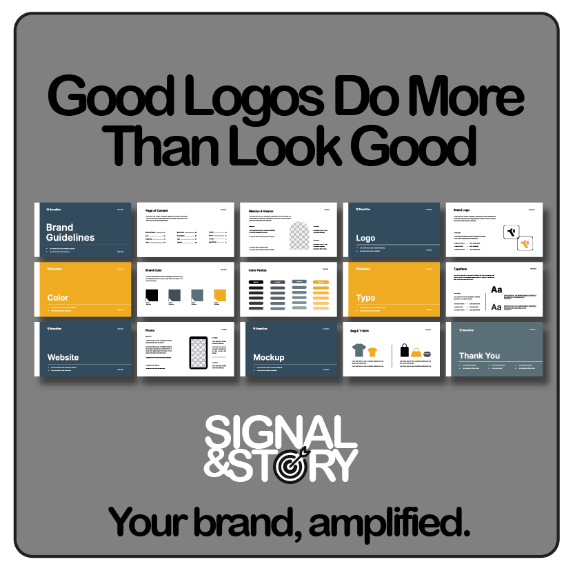
A proper logo package should include:
- Vector formats such as AI, EPS, or SVG
- High-resolution PNG and JPG files for web and social
- Clear guidance on which files to use and when
If you cannot enlarge your logo without it falling apart, you do not have a logo. You have a picture.
Local Does Not Mean Literal
A common trap for place-based brands is being too on the nose.
Mountains. Trees. Rivers. Rustic scripts. None of these are wrong, but they are often overused. When everyone looks local in the same way, no one stands out.
Example:
In many mountain towns, you can spot five logos in a row that all feature peaks, pine trees, and distressed type. They may be well designed, but they blur together.
The strongest place-based logos focus on personality and story, not scenery. They feel rooted without being obvious.
Your brand is more than your zip code.
Familiar Beats Trendy
Local brands build trust over time.
Logos that chase trends often age quickly, forcing rebrands that confuse regular customers and weaken recognition. What feels fresh today can feel tired surprisingly fast.
Example:
Ultra-thin typography, exaggerated letter spacing, or hyper-minimal symbols may feel current right now. But when trends shift, those logos often feel dated before the business itself has changed at all.
A strong local logo feels:
- Timeless rather than trendy
- Confident rather than flashy
- Familiar without being boring
If it feels calm and steady, that is usually a strength.
Your Logo Should Support the Whole Experience
For place-based brands, the logo is only one part of the experience.
It should work alongside interiors, menus, printed materials, photography, social content, and signage. A strong logo makes everything else feel cohesive. A weak one forces you to compensate everywhere else.
Example:
If your menu design, signage, and social posts all feel disconnected, the logo is often part of the problem. Not because it is bad, but because it was not designed as part of a system.
A logo should anchor the experience, not fight it.
Quiet Logos Often Work the Hardest
Some of the most successful local brands do not have loud logos.
They have clear ones. Consistent ones. Logos that fade into the background while the experience takes center stage.
Example:
Think of the places you return to again and again. Chances are their logos are familiar, easy to spot, and unremarkable in the best possible way. Understated is not underpowered.
A Logo Checklist for Place-Based and Local Brands
Use this before approving a logo or hiring someone to design one.
Function & Usability
- Is it instantly recognizable at small sizes?
- Does it work as a social avatar, favicon, and map icon?
- Can it be used vertically, horizontally, and as a standalone mark?
- Does it remain clear in black and white?
- Does it hold up on both light and dark backgrounds?
Physical & Digital Reality
- Will it reproduce cleanly on signage, menus, apparel, and print?
- Can it be fabricated, cut, embroidered, or vinyl-applied without losing detail?
- Does it look just as intentional on a phone as it does on a building?
File Format & Deliverables
- Was it designed as vector artwork, not clip art?
- Do you have AI, EPS, or SVG files?
- Are high-resolution PNG and JPG files included for web and social use?
- Do you know which files to use and when?
Brand Fit & Longevity
- Does it feel appropriate for your community and audience?
- Is it distinct from nearby competitors?
- Will it still feel right five years from now?
- Does it support the larger brand system rather than fight it?
If several answers are no, the logo may look finished but is not yet functional.
Final Thought for Local Brands
Your logo does not need to explain everything you are or where you are.
It needs to be recognizable, adaptable, and trustworthy across digital and physical spaces. It needs to feel right for your community and strong enough to grow with you.
When done well, a logo becomes part of the neighborhood. Familiar. Dependable. Easy to spot.
That is real brand equity for place-based businesses.